In the first part of Portrait Photography – to smile or not we looked at how to cope with having your portrait taken, facial expressions and general tips on posing. In this second part I’m going to look at location and the importance of portrait backgrounds and what makes a good tag photo for social media.
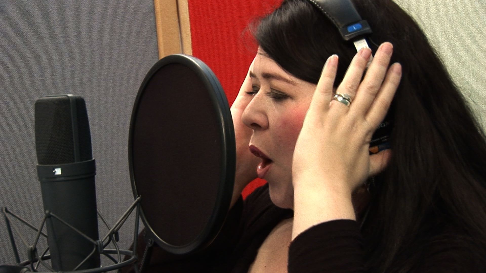
If you are going along to a studio for your portrait you are going to have less control over the background since you are sharing this decision with the photographer. The photographer will have a range of backgrounds to suit most situations ranging from pure white sets favoured by modern day family groups to neutral greys and blacks for more formal images.
Often there will be options of mottled or diffused colour backdrops or even in some cases green screen techniques for adding in images of your choice for a fun background.
If given a choice from the above the most important elements to remember is not to either clash with the background or to merge with it, for example a white shirt worn on a white background is not ideal unless you are aiming for the floating head style of image. In the same vein a black suit against a black background is going to loose you in the gloom unless you are heavily backlit to separate you from the background.
Having said the above sometimes a black background with a coloured gel light to it matching a theme colour in your attire can be very effective.

Portrait photography in an office environment is a completely different story. Here the background may well be totally out of your control as the marketing or PR department may have either picked a company theme colour or selected an office based style of background where everyone is photographed in the board room.
In situations like this it’s worth asking the organiser 1) is there going to be any theme colours that you need to avoid in your general dress for the event or 2) if it’s a straight office style background, what is the recommended dress code. The worst result you can have is if all your colleges have turned up suited and booted and you are only in shirt sleeves or visa versa unless of course you want to prove and show how much of a maverick you are in your company!
So what’s the best style of image to select for your Facebook, Twitter or Linked in profile? Firstly it’s worth bearing in mind these images are always used small so a long shot will reduce your face to a dot on the screen and tell people nothing about yourself unless it’s an image of you with Micky Mouse at Disneyland in which case people will form opinions about you around their own opinion of The Disney Corporation, amusement parks or cartoons. Do you want others to base their opinions of you on a corporation you have no control over?
So a close in picture of your face would be the best option to start with. Where you go from there really depends on what you want to say about yourself. A good quality studio background will denote professionalism; you have taken the time to achieve an image, you have thought about your presentation. An office based desk shot might convey your business or dependent how you are dressed the fact that you are too lazy to do more than take a selfie with your computer installed camera! Some people use shots of important events in their lives, a portrait outside number 10 Downing Street shouts look at me I’m involved with important people! The complete opposite to Mickey Mouse perhaps, dependent on your view of politics?
The whole idea of images used on the social media is a visual tag so the more memorable the image the better, you want people to recognise your tag and associate it with something worth taking a second look at. I would suggest dark glasses, though cool for the celebrity under the bright lights of a studio interview might just give negative vibes in a Tag image. The eyes are the pathway to the soul it is said and many a person will make an opinion about what sort of person you are just from looking at your picture. Dark glasses – no soul!
If you are trying to stake your claim as an expert in a particular field then a relevant background is of course helpful. An event manager with their venue behind is a very relative image. Sales people with product related backgrounds another example.
On this particular area of image display remember a joke image is funny the first time viewed but any joke retold over and over loses it’s appeal.
One last thing to bear in mind, dependent where the image is placed on a page it is always better to have your image angled into the page rather than away, it visually offers what you have to say on the rest of the page. So if you are having a portrait session make sure you get a series of both profiles. Square on images can regarded as a little more harsh or direct, sometimes reminiscent of a security image which again could have negative connotations to the viewer.

Brian Russel
copyright 2014